



Website ideas

See the possibilities.
Understand the choices.

A customer comparing options needs different information from someone checking whether you can help. The page should give them a useful way forward.

Try a few ways to bring that detail together. Change the layout and atmosphere, then keep the ideas that suit the project you have in mind.

Explore the sections

Working section examples, using Knighton editorial concepts. Images and drawings explain ideas; they do not show invented client results. These are starting points for a conversation, not a menu of fixed website packages.

Am I in the right place?

Make an introduction.

Give someone a clear sense of the offer, the business and where to go next.

Editorial split

Working example

Layout concept · a useful website

Give your customers a clear way forward.

Explain what you do, show the detail that matters and make the next step easy to find.

Explore website work A clear message. One useful next step.
AI-generated editorial study of green aperture frames catching a focused beam of daylight.
Give the search a useful place to lead.AI-generated editorial concept for Knighton Digital. This arrangement is not an ad-account view or a delivered campaign.

When it fits. One clear offer, supported by a useful image.

What to think about. The image needs to add context. An unrelated photograph can take space without helping the decision.

What we need to make it useful

A short offer, one next step and a photograph with a clear purpose.

Back to layouts

Statement & routes

Working example

When it fits. A clear introduction with several relevant starting points.

What to think about. Too many equally strong routes can make the first decision harder. Keep the choices distinct.

What we need to make it useful

A concise introduction and a small set of named destinations.

Back to layouts

Image-led introduction

Working example
AI-generated editorial arrangement of portrait, square and landscape panels in ivory and forest green.

Layout concept · one clear idea

Give the useful detail a clear place.

A considered direction gives the next piece of work somewhere to start.

Explore brand & content
One idea, shaped for its placement.AI-generated editorial concept inspired by the formats in our published Raptor campaign kit. The arrangement is illustrative; publication and campaign results are not claimed. See the prepared campaign artwork.

When it fits. Work where material, place or visual detail deserves room.

What to think about. The words still need a readable surface. The image should remain useful when its crop changes.

What we need to make it useful

An appropriate wide image, a short explanation and a deliberate mobile crop.

Back to layouts

What do I need to understand?

Explain the offer.

Make room for the detail, comparison or sequence a customer needs.

Explanation & destinations

Working example

When it fits. An overview that leads to focused service or reading pages.

What to think about. A destination label needs to explain what is behind it. Avoid a row of identical “Learn more” links.

What we need to make it useful

A useful overview and distinct destinations with clear names.

Back to layouts

Related views

Working example

Layout concept · related questions

Work through the part you need to understand.

The route
Consider the destination with the channel.

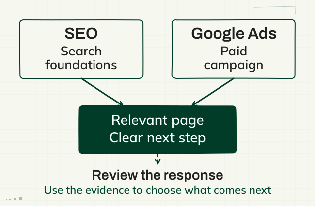
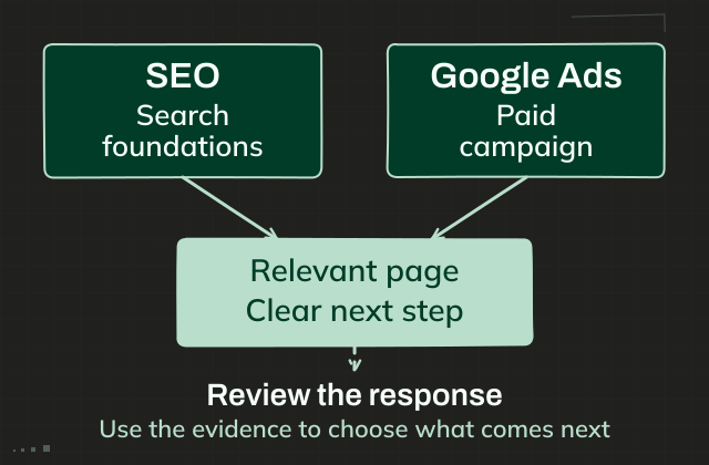
Search foundations and a paid campaign ask different things of a business. Both need a relevant page and a clear next step.

Read the full explanation
SEO and Google Ads lead towards a relevant page and a clear next step. A separate review asks what response can be measured. This is a conceptual drawing, not a measured customer funnel.
Two routes to a useful buying page.
SEO and Google Ads lead towards a relevant page and a clear next step. A separate review asks what response can be measured. This is a conceptual drawing, not a measured customer funnel.
Two routes to a useful buying page.
The evidence
Keep different records distinct.

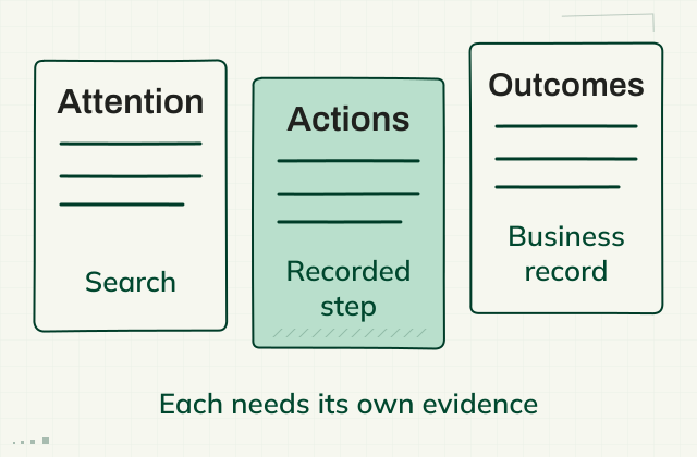
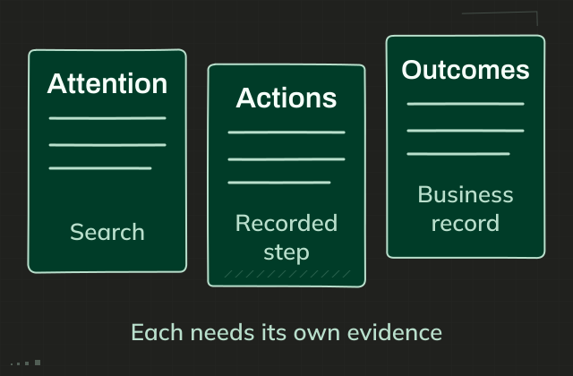
Attention, recorded actions and business outcomes answer different questions. Each needs its own evidence and context.

Make sense of the records
Attention, actions and outcomes are distinct evidence records. They are deliberately not connected as one measured funnel.
Different records answer different questions.
Attention, actions and outcomes are distinct evidence records. They are deliberately not connected as one measured funnel.
Different records answer different questions.

When it fits. Alternative views of the same subject, when one can be read at a time.

What to think about. Tabs hide the other views. If the facts must be compared together, a table or open layout may fit better.

What we need to make it useful

Related topics with a clear label and a complete explanation in each.

Back to layouts

A visible process

Working example

Layout concept · how the work takes shape

Something useful at each stage.

Your knowledge and decisions stay part of the process.

  1. 01Useful context
    Understand the business.

    Start with what you know, what you have and the questions customers ask.

  2. 02A clear direction
    Give the work a shape.

    Agree the priorities, scope and where your input matters.

  3. 03Something to review
    Make it tangible.

    Work through a draft, check the facts and gather feedback in one place.

  4. 04A considered release
    Check and hand over.

    Check the important paths and agree how the work will stay useful.

See the working process

When it fits. Work where order and responsibility help someone prepare.

What to think about. A sequence can suggest a fixed promise. Keep exceptions and responsibilities close to the steps.

What we need to make it useful

Real stages, what each produces and where the customer's input matters.

Back to layouts

What am I looking at?

Show the detail.

Give images and explanations enough context to be useful. These examples use labelled concepts, not invented client results.

An open collection

Working example

Layout concept · editorial studies

Let the material carry some of the story.

Three owned editorial concepts. Their captions keep the pictured arrangements separate from actual client work.

AI-generated editorial scene of a camera and material-detail contact sheet on a green work mat.
Useful stories start with the work.AI-generated editorial concept inspired by the composition of our published Mountain Made launch artwork. It does not depict a client shoot or a client site. See the actual launch artwork.
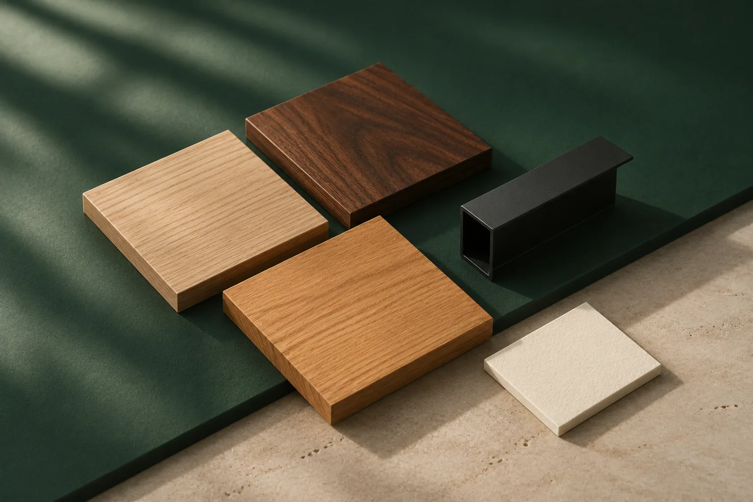
AI-generated editorial still life of timber finishes and dark metal samples arranged for comparison.
Make the choices easier to compare.AI-generated editorial concept inspired by material choices in our published STANDO collection archive. These samples are illustrative, not product photographs. See the actual collection example.
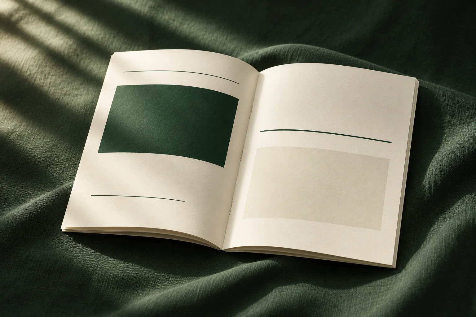
AI-generated editorial reading scene with an open ivory booklet and green linen in natural light.
Let the useful answer stand out.AI-generated editorial concept inspired by the hierarchy of our published Mountain Made brochure. The pictured booklet is not client artwork. See the actual brochure.

When it fits. Several related pieces someone may want to scan together.

What to think about. Each item needs context. A collection of images alone leaves the visitor to guess what matters.

What we need to make it useful

Related images with concise descriptions and clear source context.

Back to layouts

Image & explanation

Working example

Layout concept · image and explanation

The picture sets a tone. The drawing explains the detail.

These are different jobs, brought together around the same question.

01 / Editorial concept
AI-generated editorial study of three separate translucent panels and a magnifier on a green surface.
Give the number its context.AI-generated editorial concept for Knighton Digital. The separate panels illustrate different evidence records; no measured customer funnel or results are shown. See the dated evidence examples.
02 / Explanatory drawing
Attention, actions and outcomes are distinct evidence records. They are deliberately not connected as one measured funnel.
Different records answer different questions.
Attention, actions and outcomes are distinct evidence records. They are deliberately not connected as one measured funnel.
Different records answer different questions.

Attention, actions and outcomes remain separate evidence records. This is a concept drawing, not a measured customer funnel.

Read the context behind the drawing

When it fits. A subject that benefits from both atmosphere and a clear relationship or structure.

What to think about. An illustration explains an idea; it does not establish a measured result. Keep those roles clear.

What we need to make it useful

An image, a truthful explanatory drawing and the distinction between them.

Back to layouts

What happens from here?

Make the next step clear.

Offer a useful route forward, with enough context to know what to bring.

A direct invitation

Working example

Layout concept · a useful next step

Tell us what you’re working on.

A few rough notes, a website link or one example of what needs attention is a useful place to start.

Start a conversation

No polished brief needed.

When it fits. One obvious next step after the explanation is complete.

What to think about. A strong invitation cannot replace missing scope or contact information.

What we need to make it useful

A clear destination and a brief explanation of what happens next.

Back to layouts

Choose a starting point

Working example

When it fits. Different customer needs that lead to genuinely different conversations.

What to think about. The choices should help someone recognise their situation. Service jargon can make them harder to choose.

What we need to make it useful

A small number of distinct needs, with a useful route for each.

Back to layouts

Answer, then invite

Working example

Layout concept · before we start

A few practical questions.

What should I bring?

Rough notes, an existing website, brochures or one useful example are enough to start a conversation.

Do I need the whole project worked out?

We can begin with the part that needs attention, then agree a useful scope and the decisions that follow.

Who will I work with?

Josh stays close to the thinking and the making. Where another specialist is useful, the scope and responsibilities are agreed.

When it fits. A few common questions that matter before someone makes contact.

What to think about. Important conditions should stay visible. A disclosure is for supporting detail, not a hidden qualification.

What we need to make it useful

Real questions, short answers and an invitation beside them.

Back to layouts

Try a design decision

Try the layout. Change the theme.

Compare the same offer in four arrangements. Use Light and Dark to change their shared theme.

Illustrated layouts. The offer and image stay the same.

All examples are shown below for you to read.

Compact card

A short card helps someone scan.

Use a compact image and explanation when a visitor is comparing several services.

One offer · a compact destination
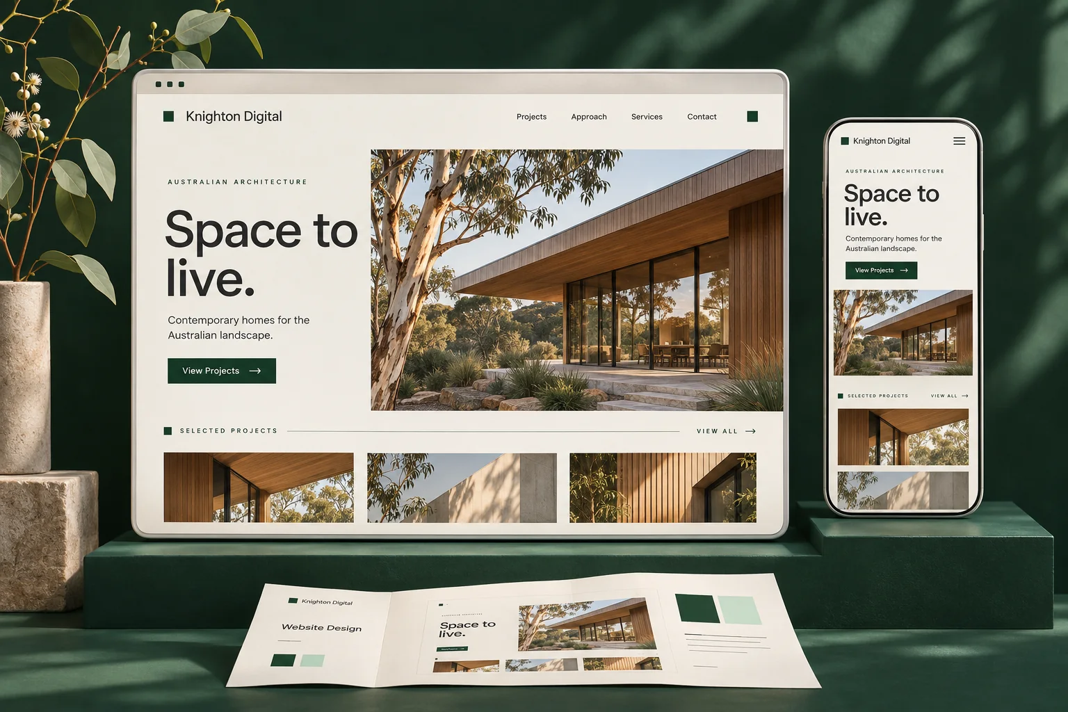
The same Knighton website concept artwork in each layout preview

Websites

A website that explains the work.

Help customers understand the offer and take the next step.

Discuss the project

Preview only. The example action is part of the illustration.

The next useful check

Compare this card with the feature layout using the same content.

Keep in mind. The card cannot carry every detail. Keep essential scope on the destination page.

Why this matters

The title and description should make the destination clear.

Feature layout

Give one offer more presence.

The feature layout gives the same image and explanation more room at a deliberate point in the page.

Same offer · more visual emphasis
The same Knighton website concept artwork in each layout preview

Websites

A website that explains the work.

Help customers understand the offer and take the next step.

Discuss the project

Preview only. The example action is part of the illustration.

The next useful check

Choose which offer deserves the space and keep supporting choices quieter.

Keep in mind. Making every item a large feature removes that hierarchy.

Why this matters

Scale and placement change emphasis without changing the offer.

Phone layout

Change the arrangement with the space.

The phone treatment stacks the image and copy when a side-by-side card would become cramped.

Same offer · a narrower reading space
The same Knighton website concept artwork in each layout preview

Websites

A website that explains the work.

Help customers understand the offer and take the next step.

Discuss the project

Preview only. The example action is part of the illustration.

The next useful check

Compare the compact and stacked arrangements, then change the colour theme.

Keep in mind. This preview is an illustration. The actual component still needs real viewport and text-resize checks.

Why this matters

Responsive design keeps the same offer readable in a different arrangement.

Shared theme

One theme, across the layouts.

Try Light or Dark above. The same shared colours update all four layout previews.

Same offer · shared design rules
The same Knighton website concept artwork in each layout preview

Websites

A website that explains the work.

Help customers understand the offer and take the next step.

Discuss the project

Preview only. The example action is part of the illustration.

The next useful check

Switch layouts after changing the theme to see what stays connected.

Keep in mind. A colour change still needs contrast and image checks; it does not prove whole-site accessibility.

Why this matters

A maintained set of design rules keeps later components connected.

The thinking behind it

Choose the layout
for the information.

A component is a part we can use again: a set of related links, a way to compare options or a closer look at an image. Its job should be clear before we choose its appearance.

Comparing facts or switching views?

If someone needs to compare the same facts across three products, keep those facts together. Hiding each product in a separate panel makes them remember what they just read.

Tabs can be useful for alternative views that make sense on their own. The choice comes back to what someone needs to do.

A destination needs a name.

A row of “Learn more” links asks the visitor to investigate each one. “Google Ads”, “Meta advertising” and “Campaign creative” give the next page a clearer purpose.

We keep the larger service page as the starting point, with focused pages for the detail that deserves its own home.

An image needs its context.

A photograph can make an idea tangible. A caption tells someone what they are seeing and why it is there. That context should stay with the image when they open it for a closer look.

A concept helps explain an idea. Actual project material shows the work that was delivered.

A connected foundation

Room for
the next change.

A new service. A longer product name. Another person taking over the updates. The structure should give those changes somewhere useful to go.

Consistent, with room for the content.

Shared colour, type, spacing and behaviour give each new page a starting point. Related information can come from the same fields, so an update reaches the places that use it. We agree what should be linked and who maintains it.

Responsive means rearranging the detail.

These sections adapt to the space available, including when the comparison view makes them narrower. The headings, explanation and next step still need a useful reading order.

Movement should help the change make sense.

A little easing can connect one view to the next. You control when it changes. Reduced-motion preferences are respected, and the examples remain readable without scripting.

A useful foundation still needs looking after.

Content, dependencies and business needs change. Reusable parts can make updates more consistent; they still need ownership and checks in their new context. New functionality or a different platform may need a separate piece of work.

The guidance behind these choices

Our examples apply established guidance to the job at hand. They do not establish a sales uplift, measured cost saving or accessibility certification for a future website.

A useful next step

Bring the idea.
We'll work through the detail.

Keep a few examples and tell us what you need them to help a customer do. You do not need to assemble the website or know the component names.

Let's talk

A closer look

Image detail