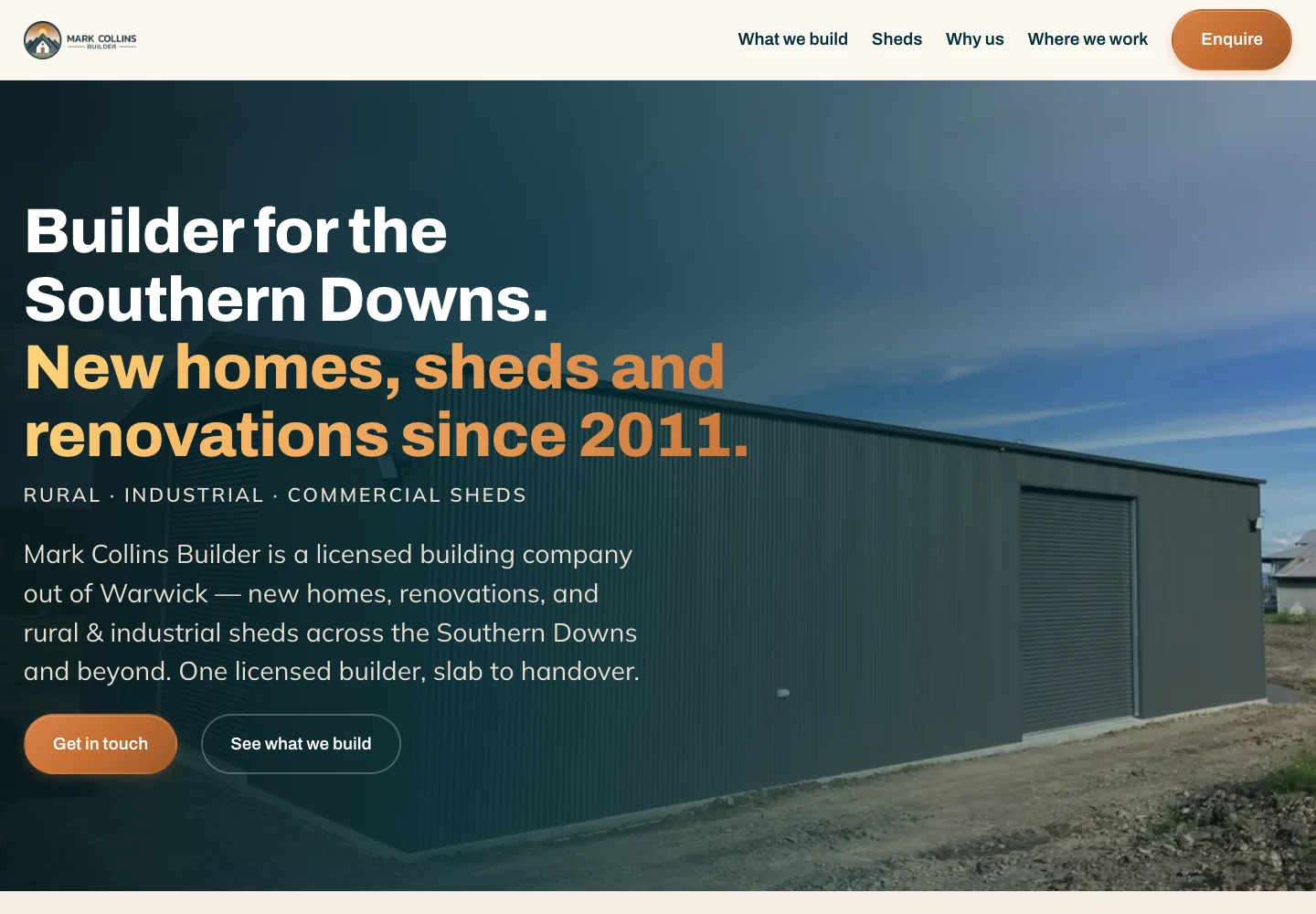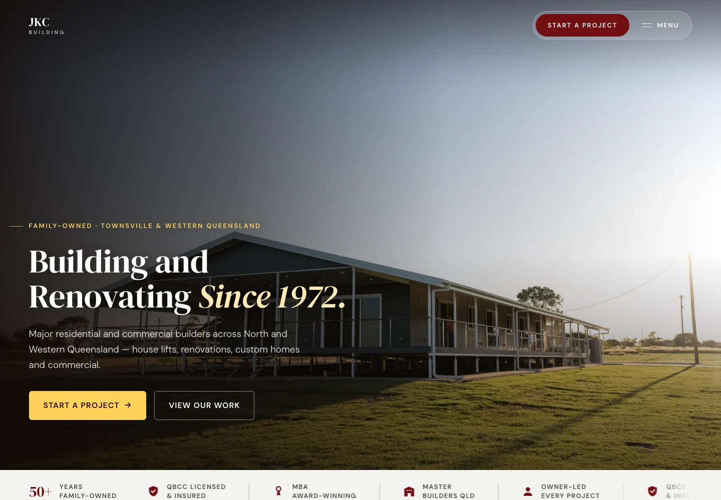
A customer may be reading on a small phone, using enlarged text or moving through a page with a keyboard. The layout needs to make room for those situations. A neat desktop screenshot is only one view of the website.
Responsive means adapting to the available space.
A responsive layout changes the arrangement of content as space changes. It should preserve the important information and the next step. Shrinking everything until it fits can leave text too small and controls awkward to use.
Every Layout encourages working with the browser and the content, rather than trying to control one fixed picture. A long product name, a new photograph and a larger text setting should be considered part of the design.
Reading behind this section: Heydon Pickering and Andy Bell / Every Layout
Reading should survive enlargement.
Headings, body text, labels and evidence notes need a sensible hierarchy and enough contrast. When text is enlarged, it should wrap and remain available. Useful information should not disappear behind a fixed-height card or outside the page.
Data tables sometimes need two dimensions. A contained scrolling table can be appropriate, provided its labels, values and keyboard controls remain usable. The W3C reflow guidance explains that distinction; it is not permission to make the whole page scroll sideways.
Reading behind this section: W3C Web Accessibility Initiative
Check the controls as well as the content.
Links and buttons need recognisable names and visible focus. Form fields need labels that stay available, with instructions and errors that explain what to do next. A person should be able to reach the important task without relying on a precise mouse movement.
An image description should explain its purpose in context. A decorative image may not need spoken content; a diagram carrying essential instructions needs an alternative that communicates those instructions. The decision follows the image's job, not a rule to fill every field with keywords.
Reading behind this section: W3C Web Accessibility Initiative; W3C Web Accessibility Initiative
Test real content before calling the page ready.
Use the longest likely heading, a realistic product table and the actual enquiry path. Test narrow widths, enlarged text, keyboard navigation and important states such as an error or an open menu. Then inspect what the page really does.
These checks support a usable experience. They are not a substitute for a scoped accessibility audit or research with the people who will use the website. Record what was checked and keep the remaining work visible.
Put it to use
A useful check for your business.
- Can someone read the important information with larger text?
- Can a keyboard user reach the task and see their focus?
- Do real headings, tables and error messages still fit?
The thinking behind this guide
Sources & further reading.
Our practical interpretation, with the references below for the specific principles and further detail.
- Axioms
Adaptable text measures and layouts that work with browser wrapping and available space.
- Understanding Reflow
Content reflow when the viewport narrows or text is enlarged, with an exception for genuinely two-dimensional content.
- Forms Tutorial
Accessible labels, instructions, validation and feedback for form interactions.
- An alt Decision Tree
Choosing text alternatives according to an image's meaning and purpose, including empty alt text for decorative images and equivalent information for complex diagrams.